Hall of Fame Design: Spotify
SPRING 2018
Introduction to Human-Computer Interaction, UC Davis
Tools: Heuristic evaluation
Spotify’s Web Player is one of the best user interface designs out there. It's a web application that allows users to stream millions of songs and create personalized playlists.

I first encountered Spotify’s Web Player a few years ago when I first started college, while I was meeting many new people. Meeting all these new people was coupled with the process of exchanging phone numbers and pertinent social media information, so we'd all be able to contact each other. People even started exchanging Spotify information, so they could see what kind of music everyone listened to. At the time, I didn't have an account because I used Youtube to listen to music, but I finally decided to create a Spotify account, which enabled me to connect with my friends and listen to music through the Web Player. From a usability standpoint, Spotify’s Web Player has huge merits in
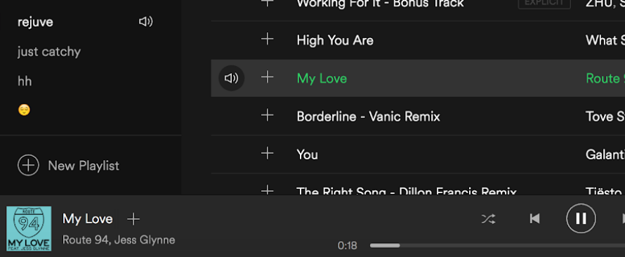
Spotify’s Web Player employs visibility of feedback in many ways, which is an important aspect of a good design because it enables users to be informed of what is going on in the application. For example, when a user clicks to play a song, the white text turns green. This feedback, coupled with the onset of audio, notifies the user that the song is in play and does so immediately.
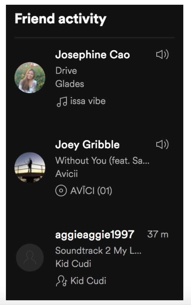
An additional example of feedback given to the user is done through Spotify’s Friend Feed. The Friend Feed is stationed on the right side of the Web Player, and it shows your friends’ activity. More specifically, the Friend Feed displays a specific friend, a specific song, and an icon.
There are three possibilities as to what type of icon is next to a friend’s name-- a pulsating speaker, a static speaker, or a timestamp. The pulsating speaker represents a friend whose song just changed. A static speaker represents that the friend is currently listening to a certain song. The timestamp represents how long ago they were listening to a specific song, so they are not currently active. With these features, users will not only see what their friends listen to but also receive insight to when exactly their friends were active. This aspect makes listening to music more enjoyable and keeps users informed about their friends’ activities.
Another aspect of usability which makes Spotify’s Web Player a good design is its learnability or in other words, the time it takes for a user to learn a task. Let us begin with the the user’s purpose. The ultimate purpose of Spotify’s Web Player is to play music you want, and the application’s layout makes the application incredibly learnable. If you know exactly what you want to listen to, you can easily locate the search bar which is always at the top of the application. If you want to browse through your playlists or libraries, the left side of the Web Player provides all those selections. If you want to see what your friends have been listening to, look at your Friend Feed on the right. Then the center of the Web Player is the visualization of whichever library, playlist, or friend you select.
Thus, with all things considered, the Web Player is organized in such a way that enables users to figure out what they want to do immediately, and it requires very little time to learn. Therefore, since Spotify ensures strong visibility of feedback and efficient learnability in the application, the Web Player is a good design.
Hall of Shame Design: Zara
In contrast to the Spotify Web Player, a website for the fashion retailer Zara, should be considered as a “hall of shame” design.
The purpose of Zara’s website is for people to be able to browse and buy their clothes online, instead of shopping at the mall. I first encountered Zara’s website while I was doing some online shopping. I came across a list of online retailers, and I clicked Zara because their clothes seemed sophisticated yet casual. In the end, I didn't end up buying anythin because it took too much time to look at items, and I didn't find anything I liked. However, from usability standpoint, Zara’s website has deficits in aesthetics and consistency, which make it a bad design.
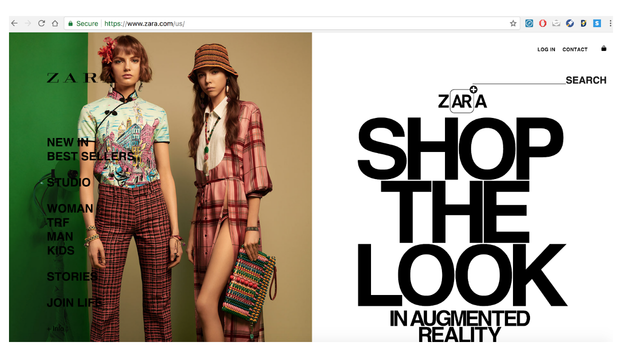
Zara’s website aesthetic is too noisy. The homepage text is constantly switching between black and white colors because the background image is always changing. Sometimes the images won't provide enough contrast with the color of the text, so it can be hard to see. Since there are so many changes happening all at once, this causes the user to become distracted.
Users can be overwhelmed especially if it is their first time visiting the website. Furthermore, while browsing their clothing catalog, the left bar containing all the navigation options constantly overlapped with the clothing items and obstructed the view of certain items. Because of this, users will not be able to fully see certain items and will not be able to make good judgements while shopping. As a whole, Zara’s website aesthetics are all over the place and too distracting, which take away from a satisfying online shopping experience.
Moreover, Zara’s website does not employ the aspect of consistency. While browsing through their clothing catalogs, the item layout is inconsistent. Some rows have three items while other rows have four. Furthermore, a few items do not even have the prices or any information underneath the image.
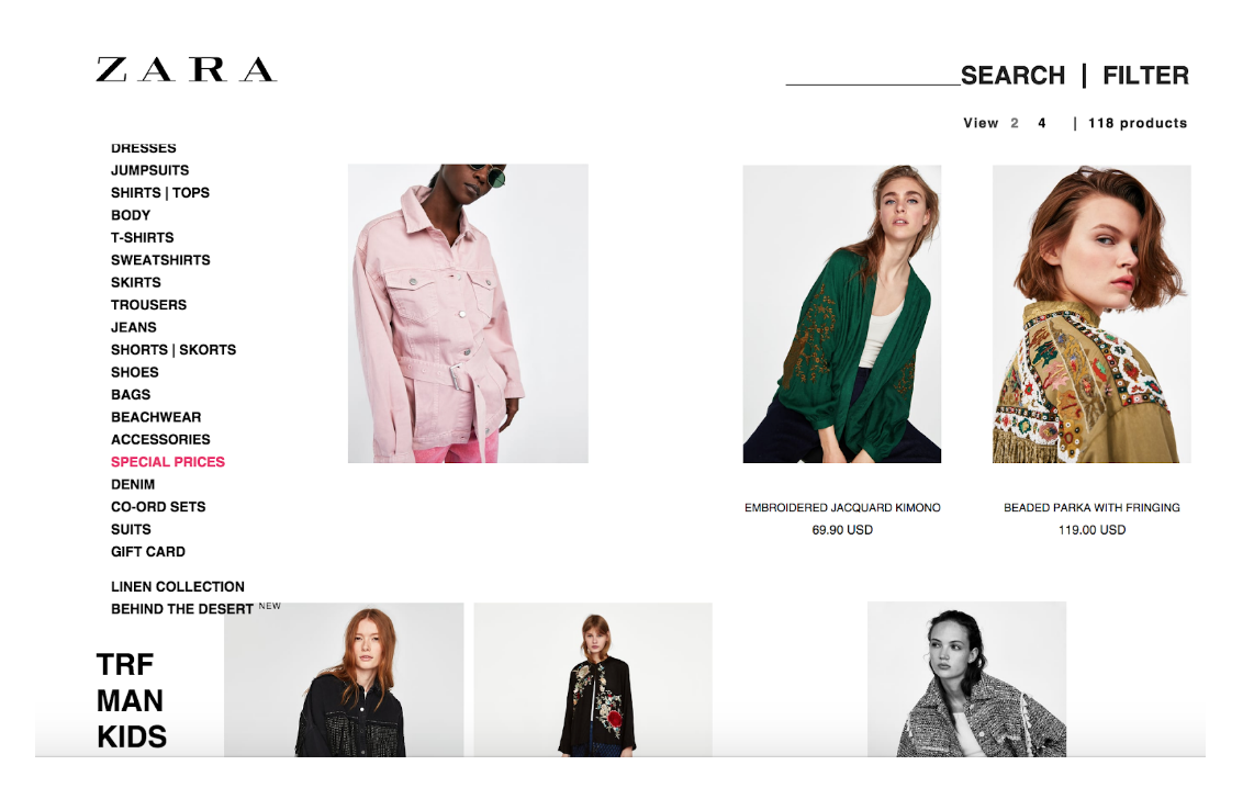
These inconsistencies will make users confused. Are the items with no immediate information still for sale? Are certain rows different because the items are categorized? Thus, users of Zara’s website will definitely be confused and will waste time clicking between pages to determine the status of an item. Therefore, Zara’s website lacks strong aesthetics and consistency, both of which lead to a poor shopping experience, making this user interface a bad design.
Final Thoughts
Spotify’s Web Player and Zara’s online retail website are two contrasting designs that employ usability principles in user interface design differently. Even though their functionality purposes are different-- Spotify’s Web Player enables music streaming and Zara’s website entails online shopping, no matter what the functionality is, each user interface design should employ basic usability principles that will make human interaction with the design feasible.
Spotify has merits in visibility of feedback and learnability. This makes the user enjoy listening to music and discovering new music through their friends. Because of this, Spotify is positioned as the leading music streaming service in America. On the other hand, Zara has deficits in aesthetics and consistency. Although their fashion company is relatively big in stores, their online retail is lacking, and leaves customers unsatisfied. Thus, when creating a user interface or an interactive design, one must evaluate usability and usefulness from a user-centered design perspective to ensure that their design or product will be successful.