Ringly: A Product Analysis
SPRING 2018
Introduction to Human-Computer Interaction, UC Davis
Tools: Heuristic evaluation
Ringly is a company that produces smart jewelry, more specifically smart bracelets and smart rings that actually look like real jewelry.

Features
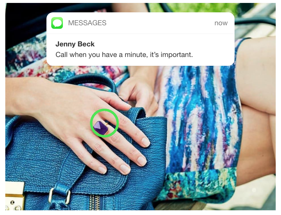
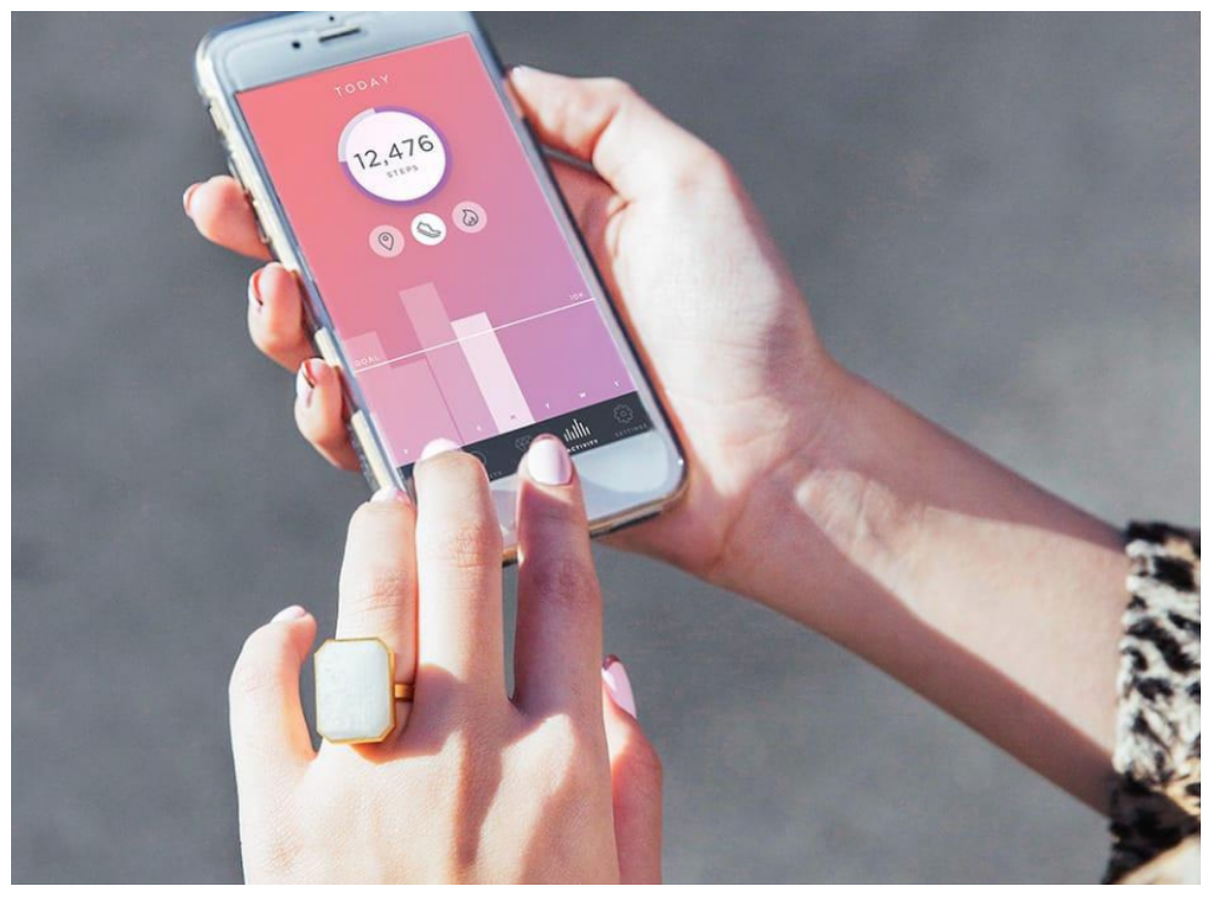
This smart ring is equipped with features to help the user stay connected to important activities and social media. Users can connect the smart ring to their mobile phone and connect with over 200 apps that alert users on a normal basis. The ring alerts users through different vibration settings and lights. For example, on the Ringly mobile app, suppose you choose Facebook and Instagram for alerts. You can set a unique vibration pattern or light flash to each app. This ring also allows users to monitor their health activity through number of steps taken, calories burned, and distance.
Usability
In order to determine whether a design is usable in UX, we must use a heuristic evaluation. One of the most important aspects of a usable design is the visibility of feedback, informs users about what is ocurring in the application. Ringly implements visbibility of feed back well. For example, once users receive a notification, the ring will notify the user though feedback of vibrations or flashing lights. One vibration could signify a text and two vibrations could signify another type of notification. This feedback lets the user know immediately that they probably received a text or social media notification depending on their settings.
As for finding a match between the system and the real world, the smart ring’s vibrations and light flashes are easy for the users to understand. In today’s world everyone is constantly surrounded by mobile devices, so vibrations and flashing lights on the smart ring are easy for users to understand.
For user control and freedom, the ring itself does not employ much of either. The ring only serves as a device to alert users of any notifications and keep track of activity in the background. Users cannot change settings on the ring, so they can only do so through Ringly’s mobile app. Suppose a user is in the movie theatre, he or she has to user their phone and manually turn off their alerts. Thus, the smart ring itself does not have much control or freedom for the user.
Consistency and standards are not too evident in the smart ring. Other than the notion of vibrations and lights that are consistent with mobile devices to alert users, there is no need for consistency elsewhere in the ring. There is also no specific error prevention or help for users to recognize, discover, and recover from errors, or help and documentation that come from the ring. All the ring does is just alert and track.
Ringly’s smart ring employs the concept of recognition over recall rather well. This is evident when the user sets notifications from certain apps as a unique vibration or unique light flash. For example, if the user sets two vibrations for a text message, when the ring vibrates twice, the user will recognize that the two vibrations represents a text message.
As for flexibility and efficiency of use, it's nice that the ring notifies users seamlessly throughout the day, but I feel like the smart ring still isn't incredibly flexible and efficient just because users still have to deal with their notifications, change settings and look at their activities separately on their phone. The flashes of light are also only on the sides of the rings, so the user might not be able to see it in certain settings.
The aesthetic and minimalist design is one of the merits of Ringly’s smart ring. Unlike normal wearable smart devices, the ring design is not centered on the technical aspects; it looks like an actual ring with a jewel. The colors and jewels would also complement looks and outfits well. One drawback of the ring is that it is too bulky because it has to incorporate all the hardware, as seen below. As a result, the size is impractical.

As a whole, the merits of the design are the visibility of feedback, match between system and real world, recognition over recall, and aesthetics. The ring lacks user control and freedom, consistency and standards, error prevention, help for users to recognize, discover and recover from errors, and help and documentation. Overall, I feel that the design would work well for users who want to wear a smart device that looks like real jewelry and also do not have to time to check their mobile phone throughout the day. The smart ring will do a great job of notifying the user of what types of notifications they are getting without having to take out their phone and check.
Final Thoughts
Overall, Ringly’s smart ring still has drawbacks so I propose solutions to overcome these drawbacks. The first drawback is user control and freedom; users must go through the mobile app to change settings or turn off the device, and don't have much control of the device. I do think adding a screen to allow changes would defeat the purpose of having the smart ring look like an actual ring, so I feel that the smart ring should have buttons on the back or possibly touch sensors to allow users to change the settings or turn alerts off without using the mobile app in case they are in a more quiet setting.
Also the flashes of light are along the sides of the ring, so it may be hard for users to see in a bright setting since the lights are not facing them. Thus, removing the light flashing option and just having vibrations or adding a light beneath the gem would be more practical.
For the aesthetics of the design, I mentioned that the ring was a bit bulky, so if cutting down on unnecessary hardware like LED lights could reduce the size of the ring, the design would be less bulky and more practical for everyday wear.
As for consistency and standards, error prevention, help for users to recognize, discover and recover from errors, and help and documentation, I don't think it would be practical to employ all these concepts on a smart ring designed to look like a real jewelry piece. I feel that going through errors, preventing them, and acquiring help should be through the mobile app.